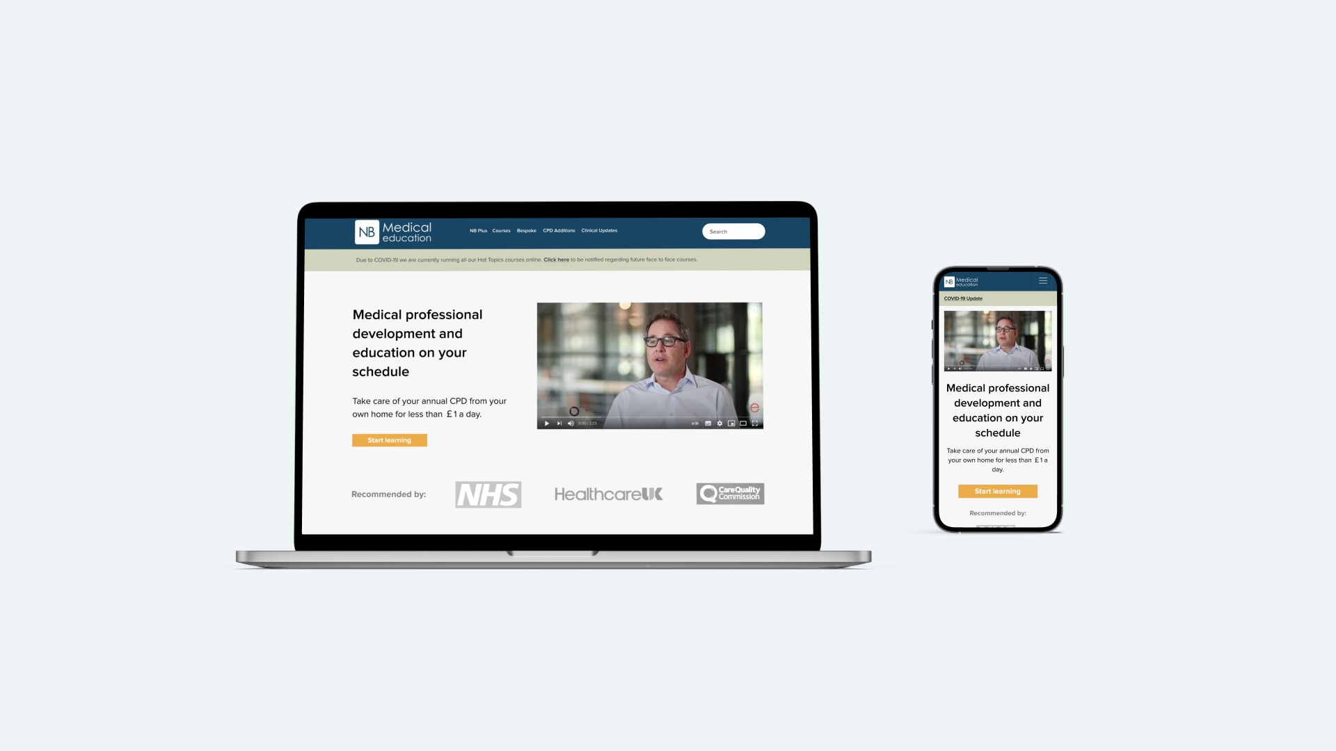
NB Medical
Role: UX Designer
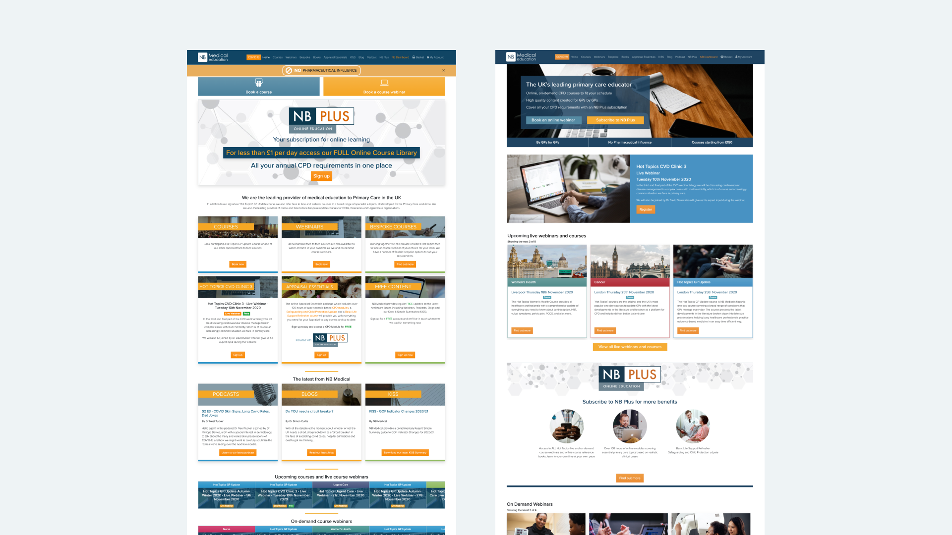
Previous website
Challenge
NB Medical provides courses for medical practitioners in the UK. In the face of the pandemic, the business was adapting to offer more online content, as well as subscription based pricing. Despite the world moving online, NB Medical’s new user numbers remained stagnant. With a team of a Content Strategist, a Data Analyst and a UX Designer (myself), we worked on changes to their website to increase their conversion rate.
Research and Problem
To understand the current state, we conducted user interviews, user testing (both with existing users and potential users) and heuristic analysis to unveil a few key ares of focus.
Existing users extol the quality of the courses, but this quality is not reflected in the design of the website.
The component upselling the subscription pricing is quickly skipped in the checkout flow.
Users are reluctant to enter into a new subscription contract.
How might we convey the quality of the NB Medical courses to a new user in order to increase its conversion rates?
Solution
We designed a simplified version of three key pages of the website: the home page, the subscription offer page and the product page. Some of the key design changes I implemented to refresh the pages included:
Refining the text hierarchy and typography to make the website look clean. This included categorising content, breaking them down into bullet points and subheadings to enhance readability.
Renaming courses to better reflect the content of the course and provide interest to a potential user, rather than the existing ‘topic - date - location’ format.
Refreshing the imagery to avoid repeated images in each product card.
Homepage before and after
Outcome
The project was a success - it led to an increase in transactions of 15% which was £43,195 in incremental revenue over a year.


