Newcastle Building Society
Role: UX Designer and Content Designer
Challenge
Newcastle Building Society (NBS) is a financial institution offering banking services in the UK. One of its revenue streams, remortgaging, was slowing in growth. Our project team was tasked with increasing its conversion rate in order to acquire new customers.
Approach
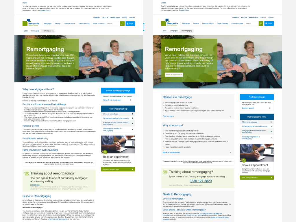
Because of limited budget and time constraints ahead of an upcoming website rebuild, we focussed entirely on improving the conversion of this specific page. To start we performed a competitor analysis to uncover any simple but effective changes we could make to the web page to improve its results.
Solution
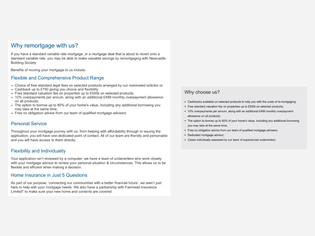
Using Figma I created some wireframes to illustrate some refinements that could quickly and easily made to the webpage to help users feel confident with switching to NBS for their mortgage. Refinancing your mortgage can be an intimidating task so we wanted the information to feel thoughtful and digestible. We broke up lengthy chunks of text into more readable and easily scannable sections. We moved the most important information and persuasive details towards the top. And we made call to actions clearer and more obvious.
Outcome
I implemented the changes to the webpage with Google Optimize. Although the conversion rate was not as high as we initially expected, the project allowed us to conduct an A/B test for the future.


